Standard Oil - Atlanta, GA | Powder Springs - Marietta, GA

Powder Springs
Korner Kupboard Food Store | Standard Oil Products
1185 Powder Springs St
Marietta, GA
Revisited: November 12, 2023 | Original Publication: February 2, 2021
Welcome back to The Sing Oil Blog! Rather than publishing a standard post, today I'm going to change it up and circle back to the second ever post to go live on this blog. While a lot has changed over the last couple of years (including the composition of my posts), my fascination with oil companies has remained. Recently, Retail Retell left a comment on my LaGrange #1 post mentioning a YouTube video he thought I would enjoy. Little did he know, I had traveled down the Standard Oil rabbit hole over a decade ago and was well aware of the story we'll examine today . . .
Since I'll be discussing Standard Oil, I figured it would be fitting to tie that history into my post on the former Power Springs "Sing" station. What I wrote over two years ago seemed bare compared to what I publish now, so I figured it would be worthwhile to jazz it up a bit. Let's breeze through that portion of the post before continuing onto the meat and potatoes.

The Powder Springs station was built sometime between 1972 and 1976 in what was at the time a developing area of Cobb County. Sing had an agreement with Standard Oil Company of California (Chevron) to co-operate several stations in the Atlanta Metro including this station, a station on Chamblee Dunwoody Road, and several others. As shown by the image above, the Powder Springs store was built to Sing specifications with everything from the convenience store, pump canopy, parking lights, and even sign hardware using Sing's design language. The only thing absent from this station is the Sing logo, as the design was "Standard" in name only. I'm not aware of any other Sing stores that specifically sold Standard gas (Carrollton had a Chevron sign out front, while a handful of other stations are mentioned as selling Chevron fuels), but it seems that Sing preferred using Standard's branding here since the oil company already had a sizeable and established presence. However, it is interesting that Standard/Sing decided to brand the food store as "Korner Kupboard" instead of Sing since the Chamblee Dunwoody Road store exclusively carried the Thomasville-based company's name.
This "Sing" survived in some form until the early 1990s, shortly after the Amoco-Sing merger. I'm not sure if the station ever converted to the Amoco brand, but Amoco had the property surveyed in 1990 and ultimately sold the station to Checkers on July 21, 1993. It wasn't long before Checkers leveled the station and built a restaurant on the site. By the early 2000s, the Checkers had closed, and the restaurant had also been torn down. Currently, the corner is now occupied by an AutoZone that was built around 2005. Ironically, a Chevron is now situated just across the street.
 | ||
Cobb County Superior Court Records - October 13, 1989 Amoco Site Survey of Powder Springs Station |
This station is one of the few to have scanned copies of original documentation available for free online. In addition to the warranty deed for Amoco selling the property to Checkers, I found an interesting survey of the property conducted by Amoco in 1989. It looks like there was a dispute over a perimeter wall between the Sing property and the adjacent car wash that had to be cleared up before the Amoco-Sing merger was finalized several weeks later. This survey provides rare details on the layout of the station and parking lot that would otherwise be lost to time.
Now that we know a little about Sing's operation of Standard stations, let's take a look at Standard Oil Company as a whole.
An American Standard

For today's history lesson, we need to rewind all the way back to the Nineteenth Century to examine a topic I loved learning about in school. My ears would instantly perk up during my high school history classes when we would discuss The Gilded Age; that was almost certainly a harbinger for a discussion about Standard Oil Company.
According to The Encyclopedia Britannica, "The company’s origins date to 1863, when [John D.] Rockefeller joined Maurice B. Clark and Samuel Andrews in a Cleveland, Ohio, oil-refining business. In 1865 Rockefeller bought out Clark, and two years later he invited Henry M. Flagler [the same man who started the Florida East Coast Railroad and whom Flagler College in St. Augustine is named after] to join as a partner in the venture. By 1870 the firm of Rockefeller, Andrews, and Flagler was operating the largest refineries in Cleveland, and these and related facilities became the property of the new Standard Oil Company, incorporated in Ohio in 1870. By 1880, through elimination of competitors, mergers with other firms, and use of favourable railroad rebates, it controlled the refining of 90 to 95 percent of all oil produced in the United States."
The oil industry in the Nineteenth Century was very different from today in that most retail operations centered around kerosene rather than gasoline. Before electricity was commonplace, Americans relied on kerosene for light and heat, and gasoline was essentially an explosive byproduct of kerosene production that oil refineries didn't know what to do with. Standard eventually saw the potential use of gasoline with the budding automobile industry and primed itself for world domination.

|
| Next! - Udo J. Keppler (Library of Congress) - 1904 |
"Illustration shows a "Standard Oil" storage tank as an
octopus with many tentacles wrapped around the steel, copper, and
shipping industries, as well as a state house, the U.S. Capitol, and one
tentacle reaching for the White House." - Library of Congress
Standard also shifted its focus from the horizontal integration of the early years to vertical integration, as it was gaining influence in Washington, DC. (For those who need a refresher on economics class, horizontal integration is when a company attempts to buy out direct competitors while vertical integration is where the goal is to control every step of the production process.) All in all, Standard had operations in oil drilling, refining, transportation, and sales by the turn of the Twentieth Century, essentially rendering it a massive horizontal and vertically integrated behemoth. In other words, a monopoly.
The Sherman Anti-Trust Act (1890)
The Sherman Anti-Trust was signed into law by President Benjamin Harrison on July 2, 1890 as the first piece of legislation passed by Congress to outlaw trusts. According to The National Archives, "A trust is an arrangement by which stockholders in several companies transfer their shares to a single set of trustees. In exchange, the stockholders receive a certificate entitling them to a specified share of the consolidated earnings of the jointly managed companies.
Toward the end of the 19th century, trusts come to dominate a number of major industries, destroying competition. For example, on January 2, 1882, the Standard Oil Trust was formed. Attorney Samuel Dodd of Standard Oil first had the idea of a trust. A board of trustees was set up, and all the Standard properties were placed in its hands. Every stockholder received 20 trust certificates for each share of Standard Oil stock. All the profits of the component companies were sent to the nine trustees, who determined the dividends. The nine trustees elected the directors and officers of all the component companies. This allowed Standard Oil to function as a monopoly since the nine trustees ran all the component companies."
From my understanding, it seems that a trust was a legal way at the time to construct a business monopoly as it allowed the companies held by the trust to remain independent on paper all while profits were funneled back to the trust's board of trustees.

|
| Standard Oil Plant of Whiting, Indiana (Library of Congress) - 1910 |
Notably, The National Archives mentions that the act initially lacked enforceability as ruled by the Supreme Court in United States v. E. C. Knight Company (1895). The argument was that the American Sugar Refining Company did not violate the law despite its controlling roughly 98% of all sugar refining in the United States since control of manufacture did not directly correlate to control of trade.
Despite the seeming dismissal of the law, Progressive Era politicians, such as President Theodore Roosevelt, began to utilize the act for "trust busting" purposes into the beginning of the Twentieth Century. Early victories include the Supreme Court's 1904 decision in Northern Securities Co. v. United States to uphold the government's suit to dissolve the Northern Securities Company; however, the law's most famous use is why we are here today: President Taft's 1911 suit to formally dissolve Standard Oil Company.

|
| John D. Rockefeller (Library of Congress) - 1909 |
According to Wikipedia, "In 1896, John Rockefeller retired from the Standard Oil Co. of New Jersey, the holding company of the group, but remained president and a major shareholder. Vice-president John Dustin Archbold took a large part in the running of the firm. In the year 1904, Standard Oil controlled 91% of oil refinement and 85% of final sales in the United States. At this time, state and federal laws sought to counter this development with antitrust laws. In 1911, the U.S. Justice Department sued the group under the federal antitrust law and ordered its breakup into 43 companies."
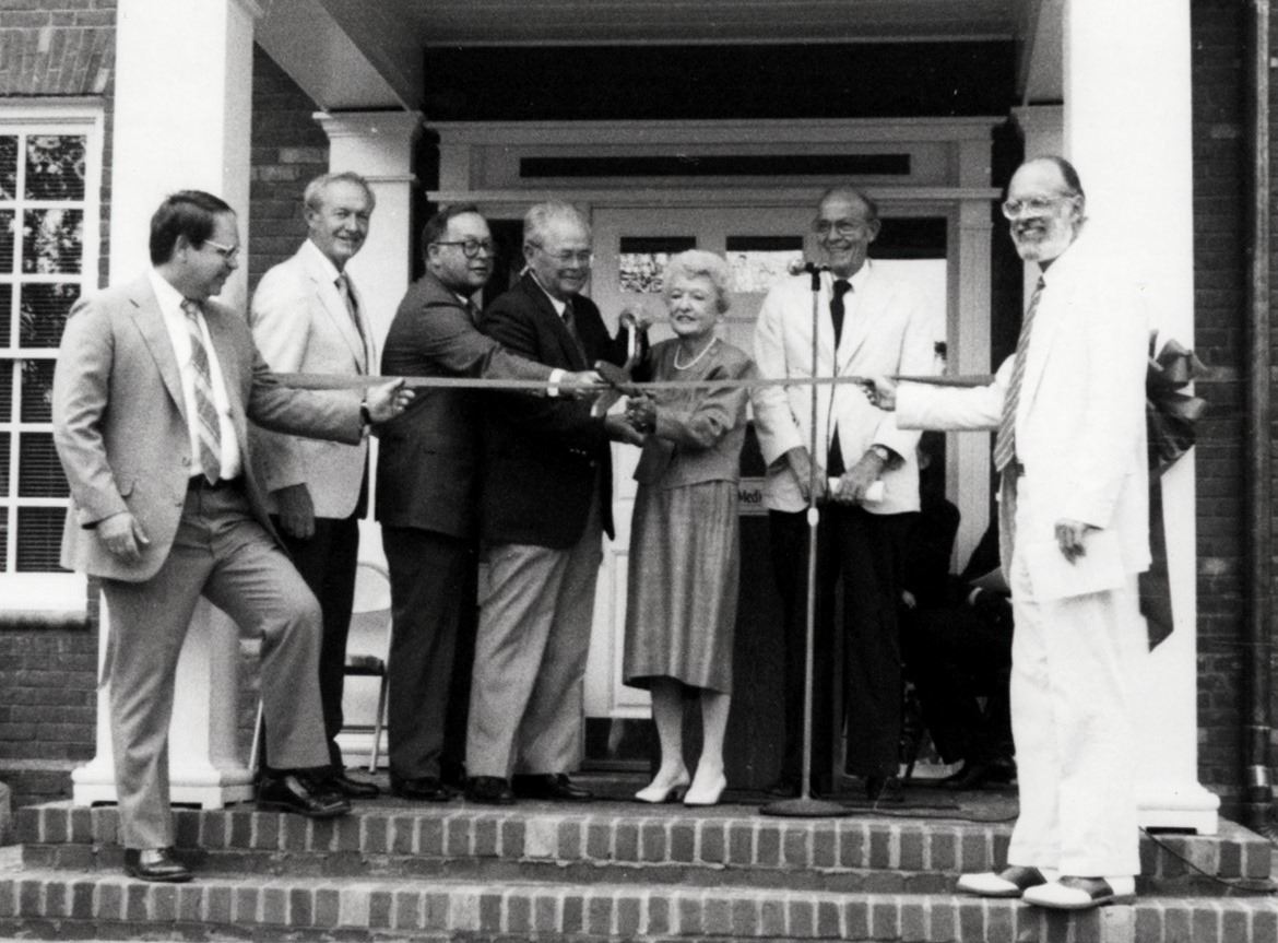
Note: this is the same John D. Archbold for whom the hospital in Sing's hometown of Thomasville, GA, was named for. Dedicated on June 30, 1925, the hospital's name was chosen following a donation from John D. Archbold's son, John Foster Archbold. The hospital also has a cancer center named in honor of Sing's founder Lewis Hall Singletary (shown here with his wife Mildred at the ribbon cutting).
While many thought the dissolution of Standard Oil in 1911 would be the end of John D. Rockefeller's companies and his fortune, the exact opposite came to be true. Following the breakup of the 43 companies, Rockefeller's net worth skyrocketed as the daughter companies he now held stock in were exponentially more profitable than the single trust was. All of the "baby Standards" went on to be very successful businesses of their own, with many recombining into the oil giants we are familiar with today.

|
| Courtesy US-Highways.com (archive.org) - Standard Oil Territories in 1911 |
Following the bust of Standard Oil, individual operating companies were granted the right to use the Standard name in specific regions as outlined above. That brings us to The Standard Oil Company of Kentucky (KYSO) whose territory is highlighted in orange.

|
| Standard Oil (KYSO) map of Atlanta - 1964 |
Unlike most of the other "Baby Standards", KYSO never adopted a marketing name other than "Standard Oil" and never seemed to venture outside of its original territory in the Southeast. KYSO also lacked refining operations of its own and purchased all of its oil products from other companies such as Esso / Standard Oil Company of New Jersey.

|
| Gas pump with 1960's Chevron branding in Cedar Key, FL |
By 1960, The Standard Oil Company of California (Chevron) purchased KYSO and thus acquired the rights to the Standard name in Alabama, Florida, Georgia, Kentucky, & Mississippi. Many stations would continue to operate in status quo for the next decade, but others began to receive Chevron branding in one form or another. One such example is this diesel pump I came across in Cedar Key, Florida. While the branding was quite faded, it was still obvious to see the logo Chevron used during the 1960's hanging on. I'd presume that the pump was originally installed at a Standard / Chevron station on the island close to 60-years ago.
Chevron slowly began to phase out the Standard brand following its logo change in 1969 and name eventually dwindled from its formerly widespread marketing territory. Today, thirteen Standard stations have been confirmed to exist across the country, one of which we will explore in just a bit.
The reason there are 13 is because Chevron made the decision to operate to operate a single outlet in each state where it owns the Standard name in order to satisfy an obscure loophole in US trademark law. That being said, the internet sleuths out there still haven't been able to find the supposed Standard stations in Hawaii and Mississippi.

|
| Courtesy Jgera5 (Wikipedia) - Standard Oil Naming Rights by State (2023) |
As for what is left of the bulk Standard Oil Company today, there's actually more than you would expect. The top three oil companies in the Fortune 500 list are all direct descendants of Standard. Specifically, ExxonMobil comes in at #3 on the list, while Chevron rounds out the top 10 and Marathon rings in at #16. Chevron, in particular, is of interest to us today since it continues to hold the rights to the Standard trademark in the state of Georgia.

|
| Esso Express station in France |
As for abroad, ExxonMobil continues to market all of its international stations under the Esso brand (a phonetic spelling of "S.O." for Standard Oil). The Esso name has also been authorized for use with Exxon's diesel marketing in the United States, but was otherwise phased out in favor of the Exxon name in the 1970's

Now, for today's adventure we'll travel to the one and only Standard station left in The Peach State.

Chevron #201793
Sing Food Store
Atlanta, GA 30306
This particular quandary is located in the heart of Atlanta's Virginia Highland neighborhood at the intersection of Virginia and Highland Avenues.

Virginia Highland (often incorrectly referred to as "Virginia Highlands" at the behest of locals) is a quaint former streetcar suburb to the east of Midtown Atlanta. The neighborhood is likely known most famously for, and was named by, its successful attempt to squash plans to construct Interstate 485 through its heart. Wikipedia notes, "When . . . residents formed a group to oppose the highway in Fall 1971, they chose the name 'Virginia–Highland Civic Association'. With the victory of the anti-highway forces, the Virginia–Highland name stuck and the press started to use it to refer to the entire neighborhood between Amsterdam, Ponce, Piedmont Park and Druid Hills."
I-485 is an interesting topic to research, as parts of this planned freeway were constructed and now serve as Georgia 400, Freedom Parkway (including the interchange with I-85), and I-675.

In addition to many historic homes, Virginia Highland also boasts a small commercial district complete with many 1920's buildings. I thought this neon sign was rather interesting . . .

. . . as were the architectural rafter tails along the eve of the building.

All of that is fine and dandy, but let's turn our attention back across the street to the reason you've come this far.
At first glance, this appears to be your average early-2000's Chevron station; it features the circa 2006 namesake badge on the canopy and full Chevron logo on the gas pumps and the convenience store window.

As for the sign, that's a different story. Rather than a run-of-the-mill Chevron, we now find that we are looking at a Standard Chevron—who woudda thunk?

It's a shame how this station has let the South-facing sign fade and grow mildew considering how it's the one with the least obstructed view. Those power lines really made photographing this station a pain!

As we saw above, the canopy also continues to bear the Standard name, making it one of the 13 to continue to do such. Interestingly, the Salt Lake City and Lake Worth Beach Standards still have the pre-2006 lettering on their canopies while the Boise Standard has a straight up vintage canopy (and a regular Chevron sign).

As for the convenience store, it uses the design language of most other early-2000's Chevron stations except for the odd choice of a Spanish tile roof.

It looks like this station sells E-85 at pumps 7 & 8 but no diesel fuel. I do wonder how often people purchase E-85 because it seems like turbocharged engines and hybrids have become commonplace enough to where we don't see Flex Fuel cars produced like they were just over a decade ago.

Back when this station first adopted the 2006 logo, it had signs that complimented the Chevron colors much better than the Harveys Yellow ones we see here today. It's a shame that they couldn't at least try to make the E-85 sign blue!
It's also worth noting how gas prices within the 285 perimeter of Atlanta tend to be 50¢ more than what you'll find outside the city; this station was no exception.

What's 4 breakfast, you ask? A Mexican burrito, of course! Whelp, here's proof that I've officially run out of things to say.

Whenever Retail Retell mentioned this, I swore I had a picture of this station somewhere but couldn't find it for the life of me. It was only after brute-force reorganizing my photos when I found this shot from a visit I made back in 2021. Those were the early days of the blog, so it is likely I intended to write something about Standard one day; however, I feel like that was more a case of me wanting to preserve a dying piece of history much like I did with a former Flash Foods back in 2017.

Anyhow, that will wrap up today's post, but I hope you enjoyed this little diversion. I'm still unsure of my blogging plans for the rest of the year, but I may take a break with new posts here until January. I have a few side projects that I've been meaning to tackle and still need to finish up my post for AFB's ongoing 10th anniversary special. Regardless, I'll let you know if I end up devising any other plans . . .
Until next time,
- The Sing Oil Blogger

Street View

Google Street View - October 2019AutoZone on the site of the former Powder Springs Station

Aerial Views

Historic Aerials - 1972Future site of Powder Springs station on Southwest corner of intersection

Historic Aerials - 1978
Newly built Powder Springs Sing station
 |
|

|
|
Historic Aerials - 1978
Newly built Powder Springs Sing station
|

|
|
Google Earth - 1993
Powder Springs station shortly after Amoco-Sing merger
|
 |
Google Earth - 1999 Checkers Restaurant on former station site |

|
|
Google Earth - 2019
AutoZone on former station site
|