
BP | Food Lion #2615 - Calhoun, GA

Former BP Station
Fast Fill / Liberty
Calhoun, GA 30701
Hello, and welcome back to The Sing Oil Blog. Today's post will be a bit different from what we are used to because I won't cover a former Sing at all; instead, we'll take a look at what Sing's cohorts were up to during the late-1980's and 1990's.
Modern gas station design isn't bad, per say, but it just feels uninspired when compared to the looks of the 1980's and 1990's. Part of this may stem from the fact that most gas stations nowadays are franchised. Why would big oil companies want to spend a lot of money to retrofit a location that was branded as a Chevron last year and will likely become a Shell in another two. While transforming a gas pump into a sleek column supporting the canopy structure may look stylish, it is also expensive and requires a lot of engineering time on a per-station basis. Wouldn't it be better to slap a generic pump topper up, regardless of whether your station is old or new, uses Wayne or Gilbarco pumps, and call it a day?
As I've mentioned before, my knowledge of oil company branding and design has far deeper roots than my fascination for supermarkets, and much of that interest can be traced back to British Petroleum's branding of yesteryear.

The year was 1988, and BP decided it was high time to refresh its image on the heels of a major expansion across the Southeastern United States. The expansion came in the form of a deal to acquire numerous Gulf Oil stations and one refinery in the Southeast while Chevron took possession of the company's other territories and refineries.

|
| Telegraph-Forum (Newspapers.com) - August 1, 1990 |
The international oil giant charged the firms Siegel & Gale and Addison Design with the task of creating a new image, and that look first debuted in February 1989 (thanks again to Ryan B. for being my design resource).
The storied shield dates back to roughly 1930 and was designed to stand as, "a symbol of solidarity and protection."
It received a few minor revisions over the years, but the 1989 rebranding was by far the most drastic. The National Post states that, "The new corporate identity is intended to promote a more dynamic, go-getting, innovative but socially responsible image, to give cohesion to the group's international operations and to motivate employees at every level."

|
| National Post (Newspapers.com) - February 7, 1989 |
The new look doubled down on BP's green image, while also italicizing the logo's typeface and adding a gold outline to the shield.
"Green is undoubtedly the color of the 1990s as the environmental movement gathers force."
If that line doesn't sound like something straight out of BP's eventual 2000 rebrand, then I don't know what does. As friend of the blog Ryan B. mentioned while we were discussing this piece, "Time is a flat circle."

|
| BP "shield" sign - Thomasville, GA - May 2022 |
Interestingly enough, this article goes on to explain how BP's environmental efforts didn't simply arise once "going green" was in vogue. "BP can claim to have become environmentally conscious at an early date. In 1927 in Britain, BP advertisements urged motorists to buy gas from the company's newly painted green pumps 'that preserve the beauties of our countryside.'"
I wouldn't quite say that it is the same level of "greenwashing" as redesigning a logo to mimic the sun or installing solar panels atop petroleum canopies, but it is something.

|
| Wikipedia - Former Sohio station using the 1989 BP design |
Anyway, it was claimed that, "In the U.S., where about 8,000 gas stations will get the new look, the changes represent 'one of the most important marketing moves we have undertaken,' John McDonald, vice-president, BP America, says."
I have to agree with John McDonald, because the branding overhaul was striking. Architecturally, I think the new station prototypes were one of the most iconic of the late-Twentieth Century and showcased an attention to detail that is seemingly unparalleled today.
Just look at how the same rectangular prism featuring two rounded sides was molded to the pump columns, the canopy, and the road signage, while a complimentary metallic box with rounded corners and seamless glazing was used for convenience stores and car washes.

|
| Former Gulf station in Boston, GA, showcasing the brand's classic white, orange, and blue colors. |
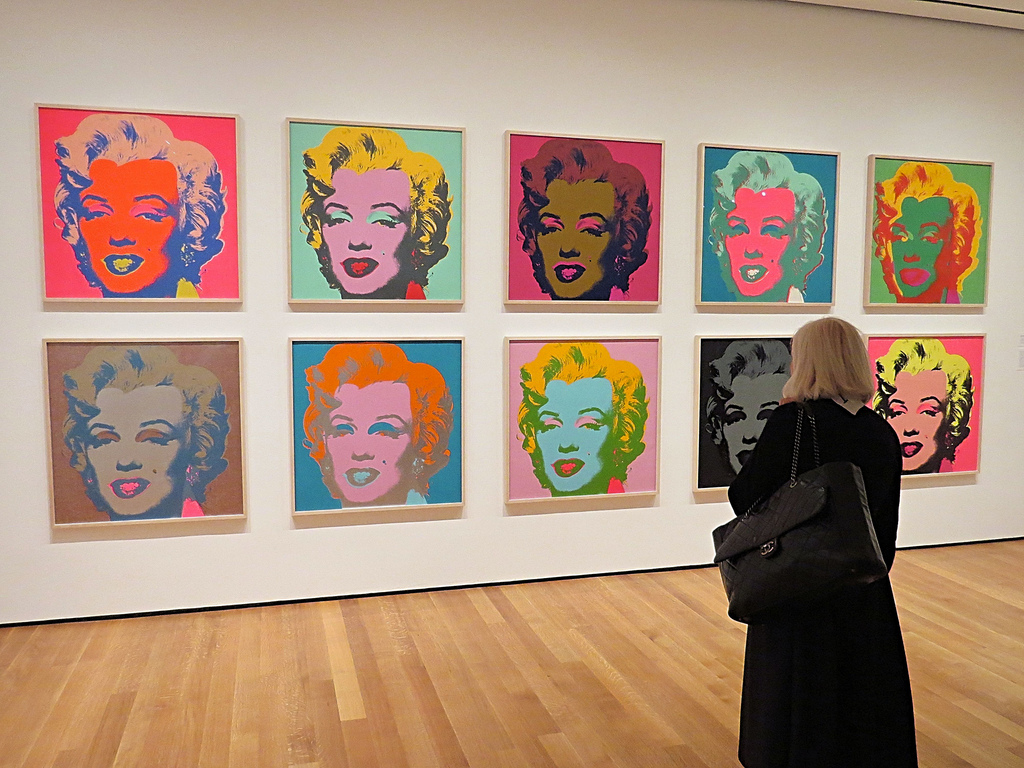
Not only was this design cohesive across the station, but it was also versatile across BP's sub brands (such as SOHIO and Gulf). I think it is the hallmark of good design when one can showcase multiple distinct looks across one cohesive image, much like Andy Warhol's portrayal of Marilyn Monroe.

|
| The Atlanta Journal-Constitution - Traffic on Roswell Road in Sandy Springs - 1989 |
With the new campaign being pushed as a way to unify BP's marketing efforts in the United States, there was a short time when those sub brands featured the new look while maintaining their traditional logo out front.
If you take a close look at this 1989 photo of Roswell Road (near Hammond Drive) in the Atlanta suburb of Sandy Springs, you can see the distinctive BP green canopy and signage paired with the orange and blue Gulf logo. This was obviously used as a mechanism to transition motorists away from the orange and white of a Gulf station to BP green, but it is still, nonetheless, strange to see.

|
| The Columbian-Progress (Newspapers.com) - July 5, 1990 |
This led to a short time when stations in other regions took a hybrid approach to branding and used the BP name in most places but reserved the road sign space for Gulf. From this black and white news clipping, we can see how this BP (Gulf) opened in 1990 with the legacy name on the main sign while new brand was used on the canopy.
What's even better is how the lower portion of the sign stands to this day, showing how BP green and yellow have been used since day one. If only I had taken a photo when I passed by to visit the Columbia Sing!

|
| Courtesy John Given (Google Maps) - Green BP-era Gulf sign in front of Hamil Hills - June 4, 2023 |
Green Gulf signs seem like they would be a rare thing since they were so short-lived, but I happen to pass by one often that's leaning against a shipping container along I-75. I bet few people who pass by realize that the simple graphic has such a story to tell with regard to the failed hostile takeover and the subsequent divestiture of the Southeastern region of Gulf to BP. Thanks, T. Boone Pikens.

|
| The Tennessean (Newspapers.com) - September 17, 1989 |
BP's menagerie of brands began to shrink as the conglomerate decided it was time to begin consolidation in 1989. The group started by swapping all Gulf stations in Nashville and several former Mobil stations on the West Coast to the British nameplate. These test markets proved successful, and the rest is history.

|
| The Tennessean (Newspapers.com) - October 7, 1990 |
This brings us to a critical inflection point when BP needed to make a good first impression on these areas. It decided to trial a bold and futuristic station design that would be easily identified by passersby.

|
| Jim West (alamy) - June 15, 2000 - BP station in Detroit - I hate using stock photos but am stuck with few alternatives. |
It's true – that rounded canopy edge was distinct. In fact, it was still easy to recognize even after these stations had received the newer Helios branding.

|
| The State (Newspapers) - May 13, 1993 |
In addition to the exterior changes, British Petroleum began to pilot a new concept for convenience store interiors: BP Express. Beginning with a trial run in South Carolina's state capital, BP Express provided shoppers with the chance to "fill up their tanks and buy fresh baked bread and fruits and vegetables," all in one place. Sound familiar?
That is precisely what bp connect was heralded for close to ten years later, while also being nearly identical to what Sing piloted with its convenience stores in the mid-1960's. As they say, the more things change, the more they stay the same.
Anyhow, the article above highlights how Columbia, South Carolina, also served as the test market for McDonald's McLean Deluxe and Burger King's addition of Domino's Pizza to restaurant menus. Maybe there is a reason why none of these concepts continue to exist?

So, what exactly can we learn from an abandoned and grown-over gas station on the side of I-75? A lot, actually.

Based on my research, this station seems to have permanently closed as a Liberty in late-2013 or early-2014 but was likely dumped from the BP brand close to a decade prior. The fact that this station was never updated to the Helios branding means that a lot of remnants were left behind: a lot of clues which are rare to find in 2024.

I first noticed this old gas station several years ago while passing by at 70 miles-per-hour, but it wasn't until the end of last year when I finally decided to check it out.
I have to say that I'm glad I did! It may not have been pristine (as shown by this missing column wrapper), but it was dern sure close to it.

Looking up the exposed column, we can see the shadow of the old casing on the ceiling – a common sight at these old 1990's BP stations. What's even more interesting, though, is how we get to see the metal framing for the massive pump topper.

|
| Courtesy Bob Henderson (Google Maps) - November 2019 - Former BP in Opelika, AL |
This generation of BP station is easily recognized in modern times by how close the pair of canopy columns reside to the gas pumps. I bet contractors hate having to install new pumps at these stations!

As for the age of this specific BP, the earliest mention I found in newspapers was a 1990 classified which advertised an RV for sale at the BP on Red Bud Road near I-75. Surely it was talking about this location.

I wasn't able to find a date on these pumps, but they for sure hail from to the 1990's – when was the last time you had to lift a door to get your receipt or use keyboard-style buttons to enter your PIN?
Then again, I noticed a sticker indicating that the credit card portion of this pump was a retrofit part. Why spend $15,000 on a new pump when you can spend a third of that on a new card reader!

The only reason why I think these dispensers may not be original to the station, however, is the fact that they use a single hose / nozzle for all grades rather than the three separate hoses for each grade.

I also want to point out how this Wayne V580D1 fuel pump features two large pipes running to the underground tanks: one for regular unleaded and one for super (or premium) unleaded. BP's 89 octane "Plus" was blended at the dispenser as a mixture of 87 and 93 rather than pumped from its own tank.

Pump number 4 had quite the rat's nest of electronics . . .

While my main draw to this station was the exterior architecture, I figured I might as well peek inside the convenience store. Heck, what's another two minute delay?

Other than the green and yellow branding from BP being replaced by the red and blue from Fast Fill, the exterior of the store looks the same as it would have during the 1990's. The seamless glass is quite sharp, don't you think?

I pressed my phone up to one of the windows, and boy, was I in for a surprise! It took me a minute to figure out what I was looking at when faced with the bright yellow signage and green text; however, I soon realized I had stumbled upon this store's original interior.

Just one look at this stock photo of old glass V8 and Gatorade bottles and there was no mistaking that this store was from a bygone era.

Despite the old Subway booths being in shambles and other fixtures being pulled away from their original homes, this space didn't appear to be in bad condition: I didn't notice any water leaks on the ceiling, the glass was relatively clean, and the floor was free of most garbage.

On top of that, the grey wallpaper featuring green and yellow stripes also appeared to be in very good shape, which shocked me considering its age.

As if we needed one more piece of confirmation that this store was a BP, we find these two stock photos on either side of the "Soda" sign. The one on the left depicts BP-branded coffee cups surrounded by a plethora of Hostess snacks while the one on the right shows a triad of fountain drink cups accompanied by chips and chocolate.
To the left of one of the fountain drinks is a bag of Doritos tortilla chips – it's hard to miss that pre-1994 Doritos logo. At least the Frito's bag and Snicker's wrapper seemingly haven't changed designs.

Continuing to the right, we find the old Subway counter that was likely once home to a Blimpie. We also find the old bottom panel for the diesel pump which was lying outside as recently as 2019.

Taking a closer look, we see that the Subway menu board is still intact. I'd settle for the $5 $7.25 Footlong considering it has Jared Fogle's seal of approval.
The fact that Jared was arrested in 2015 (which caused him to drop from being Subway's front man) and the $5 footlong was also killed off that year, I'd say these signs have to be from 2014, at the latest.

We'll quickly shift our attention to the left side of the space before returning to the Twenty-First Century.

I knew the old gas pumps would be cool to photograph, but the largely unaltered interior has to be one of the best time capsules I've stumbled upon in a long time (well, maybe it rivals the 1980's Winn-Dixie in Fort Payne).

I couldn't leave without taking several more parting shots of the pump islands.

Something that I don't often think about is how diesel being integrated into gasoline pumps only came about over the last 20-ish years. Just look at how this station's old diesel pump was stuck all by itself down at the end.

According to its website, Liberty Petroleum was founded in 2000 as a private label gas brand for independent distributors. It seems that the brand gained a lot of traction following BP's absorption of Amoco because most early Liberty stations in my neck of the woods were converted BP or Amoco locations. I distinctly remember seeing the canopy go up at one of my local BP stations and thinking that they were decorating for Independence Day – I suppose I was right in thinking the operator was celebrating independence from Britain . . .

Think about how heavy those metal panels must be.

Last, but not least, let's explore the old car wash to see what may be left behind.

The exit door may be closed . . . but the side window was not.

Through the broken glass, the smell of death penetrated the heavy summer air. Somebody had obviously taken up residence in here and brought with them a T.J. Maxx / HomeGoods buggy and a whole lot of trash. I'm just a bit perplexed about the buggy because the closest T.J. Maxx is 20 miles away in Dalton, and the closest combo store is almost 60 miles away. That's a long walk!
As for the wash itself, we see how the original machinery is still in place and advertises "BP Oil Wet Touch" – doesn't that sound oddly seductive? I think corporate should have run that by a focus group, or HR, first.
Seeing those old brushes also brings up a long-lost debate: Soft Cloth vs. Soft Brush car washes. It has seemingly been eons since I've seen a soft cloth wash like this as I think most modern car washes use rubber brushes. Then again, I'm far from an expert on the topic!

Before I left Calhoun, I had to stop at a functional gas station to fuel up. Wasn't it fitting that I chose the current BP just up the road?
Take a look at that nice Eckerd / Rite Aid / Walgreens in the distance, too.

|
| 1990's BP Shop livery - Valdosta, GA - July 2023 |
For the next piece of this post, we'll take a quick look at another 1990's BP station in Valdosta, GA. The building may use a corduroy concrete style specific to Jack Rabbit Foods, the former BP dealer in the area, but it still showcases a nice example of the 1990's BP "Shop" branding (and the old Jack Rabbit logo in the window).

The road sign out front also continues to sport the rounded 1990's design, despite being upgraded to the modern BP branding package.

The interstate sign was recently upgraded, too. I'm sure Hurricane Idalia did not treat it kindly.
While I do miss the old "sunrise" look, most of those signs are quite faded at this point. At least this store didn't still have its shield sign like the old Sunsweet BP.

Look at that: more random shopping carts!

Oh yeah, the diesel sign by the road was also showing its age (and matched the 1990's curved aesthetic, to boot).

Our parting shot is of the faded Flash Foods tanker I spotted at the Circle K across the street. Most of the Fuel South semis had been reskinned by 2023, so I knew I needed to snap one last photo while I had the chance. May the former Waycross oil company rest in peace.

Make sure to keep on reading to learn about Calhoun's Food Lion store just across I-75 – I promise, it won't take long.

You can count on us every day.

Food Lion #2615
1512 Red Bud Road
Calhoun, GA 30701
Following The Albertsons Florida Blogger's then-recent post covering the round Kash n' Karry prototype which was used at a select few Floridian stores, I figured that I needed to document a different Delhaize daughter's design during the era: the round Food Lion.
I don't know much about this prototype other than the fact that it was used for Food Lion stores during the early-2000's.

This particular location held its grand opening on July 20, 2005, as the first location for the Belgian company in Gordon County.
Upon entering the store through the angled doors, we find ourselves under a section of low dropped ceiling above the register lines.
Notice how Food Lion, like its Carolinian neighbor Ingles, offers two different colors of plastic bags: blue for cold items and white for warm. That seems like a nice way to separate your groceries!

Stepping into the produce department in the front right corner, we find a bright and well-stocked space set against the subtly curved exterior wall.

|
| Courtesy Ken Chapman (Google Maps) - March 2017 |
I'd say this space was much less sterile with the old Rutherfordton package!

It looks like there was an additional set of sliding doors which I failed to enter through that would have taken us directly into the grand aisle.
Furthermore, today's banana index lands at 59¢ / lb. Not the best price I've seen, but certainly not the worst.

The curve continues toward the bakery and deli combo counter. The white walls and simple blue stripe of the EFA 3.0 package may be a bit bland, but at least it helped this space to look sharp and clean when compared to some of the sadder Harveys conversions I've seen. The shiny new floors and fixtures really make a difference in this store!

Uhm, that's not something you see every day . . . You can "what" on us?!
As bad as Food Lion's misfortune was with this slogan, I think I about busted out into laughter when I read the text on this wall. I can honestly say I've never seen profanity make it into a supermarket's décor package, and I doubt I'll ever see it again. This makes Kroger's letter mishaps look like nothing!
Surely this wasn't a prank?!

Anyhow, you can count on me to continue our tour with a look toward the meat department. This seems to vary by store design, but this particular Food Lion lacked a physical butcher counter or window (probably for the best based on how bleached this interior looks). Instead, we just have a few upright cases and a single coffin case below a curved section of lower ceiling which mirrored the lower ceiling up front.

The grocery aisles were nothing special and just ran perpendicular to the front sidewalk. I have a theory they weren't oriented like this originally, though . . .

Here's a quick look across the other side of the meat department toward the singular service department.

The next aisle we'll see was home to paper products, air filters, and hardware items.

Opposite the "c*unt" sign was another slogan reading, "1 0% fresh or double your money back." These missing letters had to be intentional!

The left side of the store was home to the dairy, beer, and wine sections. Interestingly enough, the upright cases mostly followed the curvature of the room, which makes me wonder if the grocery aisles were once rounded as well. It looks like at least the bread aisle was.

Removing the curved shelving left us with an odd funnel at the end of the aisle.

Besides the profanity on the wall, I remember being impressed by how nicely the store was kept. The décor may not be very interesting, but the shiny new vinyl flooring and the decent selection made this a place I'd be happy to regularly shop at. If only the Belgians would have put a little more love into the old Harveys stores, but hey, at least those stores didn't convert to Aldi!

That, folks, will do it for this week. I apologize for skipping Easter Sunday and having a bit of a shorter piece today, but I've been pretty busy between vacation, work, Winn-Dixie drama, and preserving the last few traces of Foursquare. In any regard, I hope you enjoyed touring this station as much as I did, and I hope to see you back in two weeks.
Until next time,
- The Sing Oil Blogger


I take it 'You Can Cunt on us Every Day' will not be the new slogan for the Sing Oil Blog? Lol, I don't know what the story is on those signage fails. Surely it must be intentional, though who knows. Maybe it was a purely coincidental Krogeresque signage fail.
ReplyDelete59 cents isn't too bad for bananas. I've seen photos of other Food Lions selling bananas for less, though that might have been pre-Covid or something. Bananas have gone from 49 cents to 55 cents at Kroger and I think HEB as well here in Houston in recent weeks. I can't imagine what they'd be at a Florida Publix these days, but maybe that'll give Aldi some more business.
BP's commitment to the environment! Now there is something we can cunt on! I don't think anyone here takes BP's commitment to anything, other than incompetence, very seriously given Deepwater Horizon and the Texas City plant explosion.
It is good to see Gulf get some coverage here. At one time, the Gulf logo loomed over downtown Houston on the unique looking Gulf Building. That is long gone now, and Houston does not allow companies to put logos/signs on their downtown buildings anymore anyway, but it is something many older Houstonians remember: https://i.pinimg.com/736x/47/1d/a2/471da253702d5a8b02356f5e9c1a141b--houston-skyline-boulevard.jpg
No, I don't plan to follow in the footsteps of Food Lion for my catchphrases! I agree; for both of those signs to be missing the exact wrong characters, I think it had to be intentional.
DeleteFor my last few purchases of bananas from Publix, I paid 61 cents in Florida and 59 cents in Georgia. I suppose 59 cents seems to be the going rate in the area.
Bahahah! What a cunning way to turn Food Lion's slogan on BP! It doesn't seem like BP has tried to "reaffirm" its commitment to the environment since the Deepwater Horizon disaster, and that is probably for the best. It's funny to read its marketing ploys through the lens of history.
That old Gulf logo had quite the prominent placement. I wonder if that is the reason why Houston no longer allows logos on buildings.
Really awesome post! I am definitely the opposite in that my fascination with supermarkets is way deeper than gas station knowledge, but that's precisely why I've enjoyed reading this blog and learning all you have to offer. In this case, it probably also helps that I have some nostalgic feelings for that 90s BP branding, for whatever reason. (Great job duplicating it on your graphics, too.) I actually thought that logo and branding identity was much older than that, so maybe this is just me, but it feels like it developed a bit of a timeless status fairly quickly then.
ReplyDeleteRe: my lack of knowledge for gas stations... I didn't know about Sohio or Gulf being BP subsidiaries at all, so it's especially cool to see this station style with their logos attached (especially with the green Gulf background -- really detailed catch there, and very neat to see an example surviving so close to you at *Hamlin Hills)!
What really takes the cake for me here, though, is that ad from The Tennessean. Retail renderings like that are one of my absolute favorite things anyway, but this one also using the clever (if probably a bit more obscure, these days) phrasing of "We pause for station identification" is just brilliant. Love it!
As for the station itself, I'm surprised it's as well-preserved as it is, for having been abandoned that long. I've actually encountered that interior décor before, too! The Shell we typically stop at in Oxford, AL on the way to visit family in SC evidently was once a BP, and at least as far as I know still sports that design inside, old BP logos and everything. What I don't recall noticing (although it may have been there) was the gray and yellow striped wallpaper -- super cool.
Finally, it's also great to see a round format Food Lion -- I think that was a really innovative concept, and I would have loved to have seen one in its prime. While it still looks nice enough with this package, the curved aisles leaned into the format so much more, and those unfortunate décor mishaps certainly aren't ideal either!
Thank you! I had a fun time writing this post and reviving some of my older interests. I also thought this branding and station design was from earlier in the 1980's, but I guess the fact that BP underwent such a dramatic transformation with the 2000 rebrand.
DeleteSohio was entirely absorbed by BP, but the Gulf deal was much more complicated. In 1982, Wall Street mogul T. Boone Pickens led a charade for his company to perform a hostile takeover of Cities Service (Citgo). Cities Service then retaliated by offering to buy Mesa. All of this drama led to stock price volatility between the companies (which is the goal of a hostile takeover – this allows certain shareholders to make a quick fortune once a target company's price temporarily soars, from what I understand). Gulf Oil then stepped in as a "white knight" but later backed out of the deal. This created further instability for both companies, and Gulf eventually collapsed as part of a hostile takeover attempt by Pickens in 1983.
The fallout of this deal resulted in Chevron stepping in as a "white knight" in 1984, and due to federal regulation, BP and Cumberland Farms absorbed most of Gulf's East Coast stations. All three companies eventually marketed stations under the Gulf name in their assigned territories (with BP having the Southeast). Cumberland Farms ended up securing the majority stake in the name and is the company behind most Gulf stations today.
I thought that Tennessean rendering was cool too!! I also appreciated the "station identification" line.
Next time I pass through Oxford, I'll have to stop by that Shell station. I typically end up at the new-ish RaceTrac station there, but the potential of having a 1990's BP interior seems well worth the exception. I never would have guessed based on that station's nonchalant architecture.
I also would have loved to see the rounded aisles and if they hindered traffic at all. At least I still managed to catch some remnants of the original layout.
The old BP station was really fun to see! Unfortunately, BP really wasn't a super common fuel brand in the Floridian Peninsula until the Amoco conversions began and BP Connect became a thing, and what few older BP stations there were around here were typically really old service-station style locations with auto shops and a small pump island. I don't recall seeing one of these "futuristic" style BP stations around here before, but I've always liked the design from what I've seen in photos. Also, a fun fact about this style of BP stations, BP released a toy version of it in the mid-1990's that I've always thought was really cool: https://www.ebay.com/itm/256931564076
ReplyDeleteIt's certainly strange seeing a Gulf station in green though! I never knew the green Gulf stations were a thing either.
Anyway, that old Liberty station was quite fun to look at, being so well preserved from the BP days. I can't believe the original interior decor from 1990 was still present inside! For an abandoned gas station off the side of the highway closed for over a decade, I'm also impressed with how in-tact it still is and that it (for the most part) hasn't been trashed by vandals. A very interesting place overall!
As for the Food Lion, their version of the round format certainly seems like a notch down from Kash n' Karry's version, which was more visually stunning with its curved front end and service island, and the clerestory shining down over the salesfloor. Food Lion did build one store in Jacksonville using the Kash n' Karry template, but ended up settling on this design in the end (probably because it used a more simplistic format to match Food Lion's more no-frills style, unlike Kash n' Karry's more service-oriented format). Still, any supermarket incorporating curved design is interesting to see, as curved supermarkets weren't common in general.
I'm honestly surprised no shoppers called corporate about that sign by the bakery, but what an unfortunate letter to have fallen out of it! I can't help but to think a disgruntled employee was behind that letter choice too, but this store seems to be cursed with signage fails. I guess that's what happens when corporate only expects freshness 10% of the time!
I agree! I wonder why BP wasn't very common in the Peninsula. Part of the reason could be due to there being a lack of Gulf stations there in the 1980's, whereas I know of many Georgia BPs which trace back to the Gulf days. I also remember seeing that model BP station for sale a while back and wanting to buy one – what a neat toy!
DeleteThe first time I saw a green Gulf station I was very confused. I knew I had to dive into that story at some point!
I was also shocked to find that old BP interior in such good shape at that Liberty! You have a good point about the lack of damage from vandals, too. There was no spray paint in sight and the windows were surprisingly clean!
I've never been to a round Kash 'n Karry, but based on your posts, I'd agree that Food Lion's attempt was much less grand. It's still neat that the Food Lions used curved aisles.
I also wonder how long that sign stayed up (or if it remains up to this day). Like I said in the post, I couldn't believe my eyes when I looked up and saw it. Somebody either put in 1 0% effort in hanging those letters, or somebody got creative with a really long pole – those letters were very high up on the wall.